The client
Duocast BV is a Dutch company specialized in housing, hosting and internet. With the need of a new online strategy for their major brands Duocast and Adix, they were already in the process of developing a new website. During the web development it became clear that a redesign was necessary to create a fresh new look and defining style for their brands.
The logo design of the company which dates back to 2004 was done in my student years. I’d already designed assets for the corporate identity back in 2016 and therefore a different approach was needed. You sometimes need to start with a blank page, when designing for a client a second time.
The new look
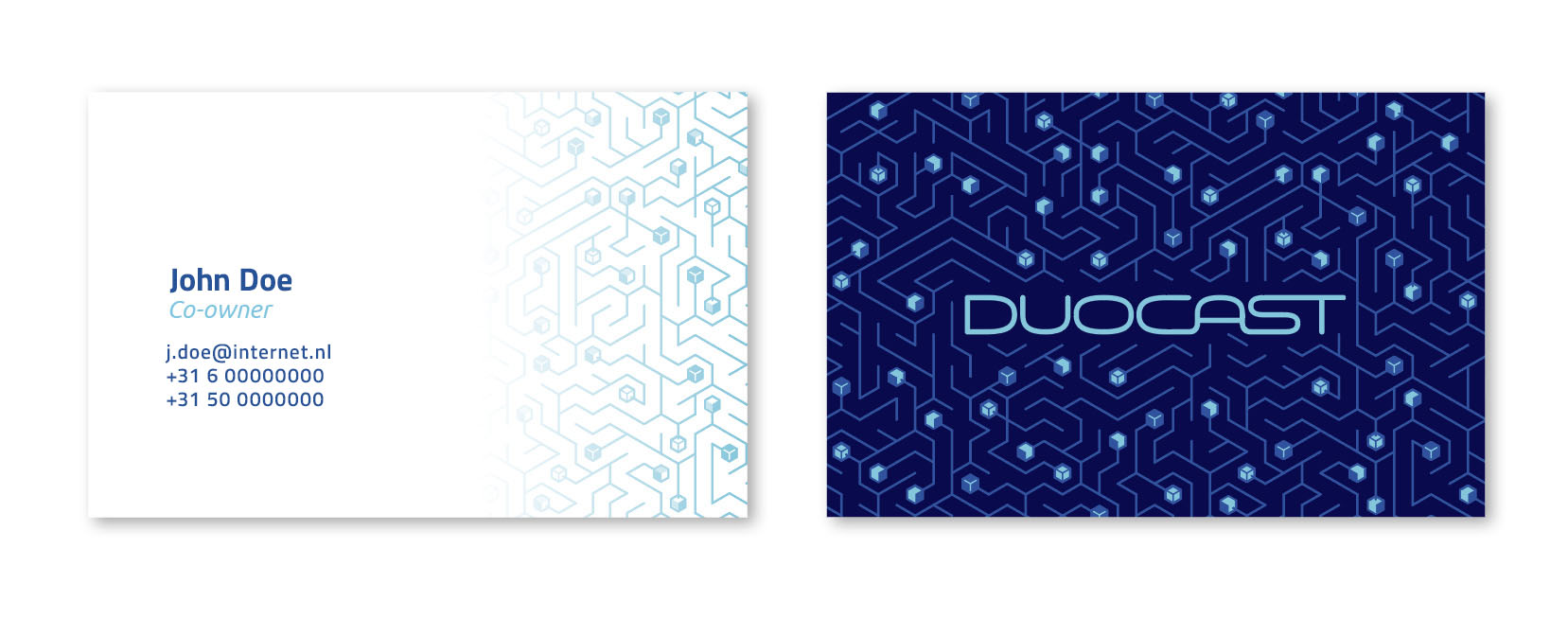
Inspired by mazes, the idea was to create some intriguing patterns with a tech feel. A range of designs was created in different color sets. This way multiple aspects of the company are emphasized in the graphics.
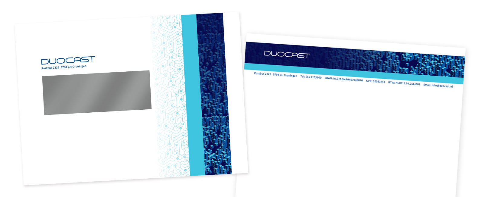
The new look obviously concerned the company’s writing paper, business cards and presentation templates too. This shows how the typography, patterns and color sets worked out in print:
The website
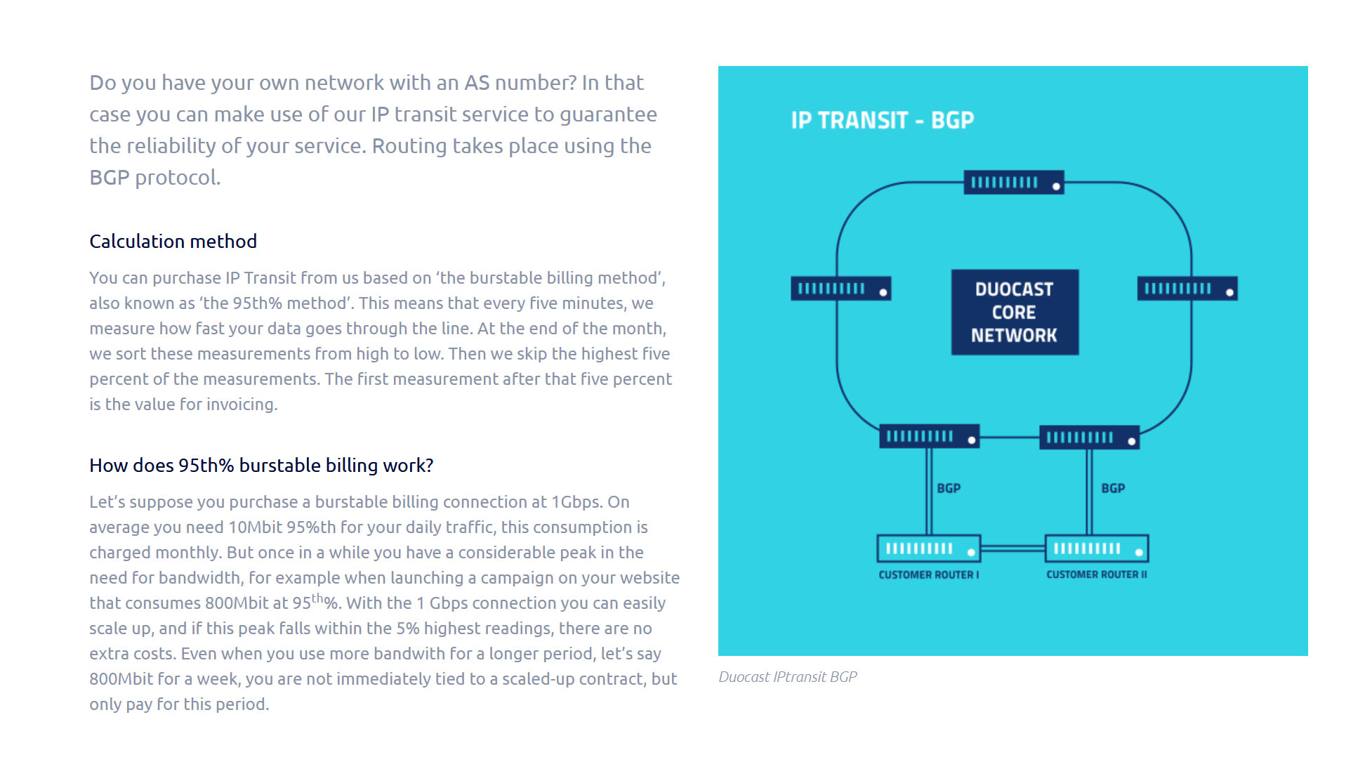
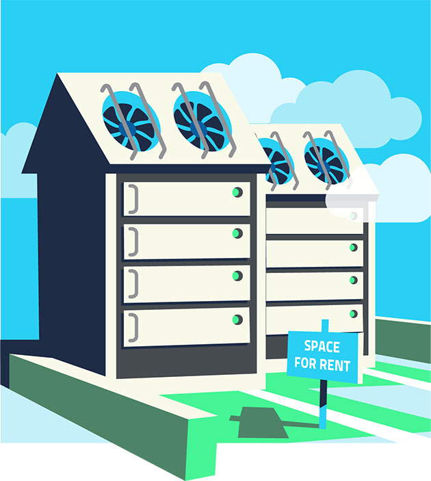
The biggest part of this redesign job was reserved for the company’s website. And because web design is not a core business of The Fairground, that comes as a challenge. The integration of the new grid theme, vector illustrations and custom designed icon pack went rather smoothly. The look ended up being pleasing for the eye, while remaining very functional.


